The 41st Worst Jobs Report Ever
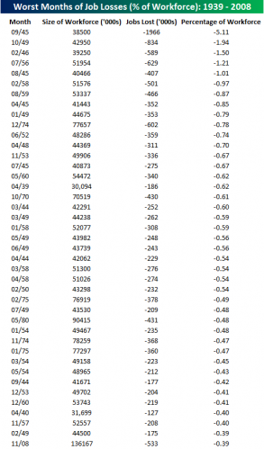
This was sent to me by a reader: Much as looking at percentage moves in the Dow is much more meaningful than looking at nominal points moves (500 points means a lot less when the average is at 10,000 than when it is at 1,000), it is useful to look at the recent jobs report in the same way. While 553,000 lost jobs is certainly a lot, it is only the 41st worst loss since WWII when looked at as a percentage of the workforce (and it would be much further down the list if we had similar metrics back into the 1930's and 1920's). Via Bespoke Investment Group:

This tends to confirm the statement I made last week, that this recession is likely worse than anything a 20-something Obama supporter can remember, but is not yet even close to some of the problem years of the 1970's, much less the 1930's.
By the way, it is interesting to see all those 1950's dates in there but no dates in the last 25 years, given there are many who have been writing about the current economy being so much riskier for workers than the 1950's.
Wow - that is telling!
It also shows why people just after WWII were worried that the Depression would return.
Problem is, many of those other drops came in clusters, and this was only the first drop in this wave. Should be sorted by year.
The supplied data confirms: It’s the worst this Century!
If we do not keep our panic up, we’ll never swallow the “medicineâ€.
Presumably, if you eliminate government jobs from the size of the work force (total nonfarm payroll less government) the 11/08 number would climb up the chart. Government is a larger employer now (16.6% of the labor force and an automatic stabilizer in econospeak) compared to the 1940s and 1950s, and actually gained 7000 jobs in November.
When the employment report comes out next month the -533 will be revised.
What was more telling about the this job report was the substantial downward revisions to the October and September job losses.