On Being Skeptical of Data That Supports My Point of View
I am pretty convinced that the case for anthropomorphic global warming is being overblown, and part of my reasoning is that other factors, like recent increases in solar activity, are being virtually ignored in the race to place a big fat blame sign on man (and on the US in specific).
So I was ready to really like this chart, via Q&O via RedState via Hall of Record (click image for larger view):

Increases in sunspot activity are generally correlated with increases in solar output, so the chart seems to show a correlation between solar output and global temperatures that is much better than the correlation with CO2 concentration. Now, this still may be correct (I have what is probably a better chart below), but this particular graph is odd in a few ways. First, the Y-axis scale is "Sunspot Cycle Length" presumably in years (thus the "y"). But how does that make sense? If it is the length of the trailing cycle, it should go up uniformly then drop to zero, like a sawtooth. I don't know who a cycle length that seems to average around 11 years can look like that line on that timescale. I tried to get back to the original, but it was attributed to a presentation that did not seem to be online by a professor that doesn't seem to work in exactly this field of study. If anyone has any insight on this chart, please comment.
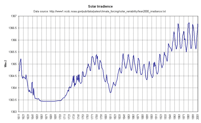
So, as much as this chart would be good news (remember my definition of good news here), I have to be skeptical of it. I do think the underlying point is a good one: It is well known that we are in a period of unusually high sunspot activity and solar output. A better chart may be this one, from this study and via junkscience.com: