Wealth and China Through History
The media tends to talk about the growth of the Chinese economy as if it is something new and different. In fact, there probably have been only about 200 years in the history of civilization when China was not the largest economy on Earth. China still held this title into the early 18th century, and will get it back early in this century.
This map from the Economist (via Mark Perry) illustrates the point.
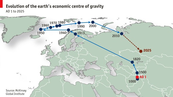
Of course there is a problem with this map. It is easy to do a center of gravity for a country, but for the whole Earth? The center in this case (unless one rightly puts it somewhere in the depths of the planet itself) depends on arbitrary decisions about where one puts the edges of the map. I presume this is from a map with North America on the far left side and Japan on the far right. If one redid the map, say, with North America in the center, Asia on the left and Europe on the right, the center of gravity would roam around North America through history.
If you want to avoid the problem(s) associated with a projection, treat each datapoint as a vector quantity and project the final (average) vector back out onto the surface
Warren:
I think you are thinking two-dimensionally. I assumed that they used a globe and found the shortest weighted distance. Another way to think about it is the surface point closest to the true economic center of gravity (which would be underground). It ought to be skewed towards the pole because the earth is not perfectly round.
The real problems have to do with assumptions like how to model the distribution of wealth or income within a geographical area (use the geographical center point? the capital? the biggest city? a weighting of sub-geographies?) and with currency conversion (market? black market if different? purchasing power parity?).
Max
The method of calculating and plotting the economic center is not the main issue. The concept of a global economic center is the main issue. It is a dumb idea with no relevance to anything. It would be much better to use color codes to represent relative economic activity and then show how the distribution changes over time.
Economic center of gravity for a planet as sparsely populated as the Earth is like calculating the center of mass of all the deer in the world. It tells you what point is most approximately equidistant from each deer, but says nothing about the movement of herds, which is the main dynamic of the species.
Indeed. Europe and the Med Coast has been the main driving developmental force since before 1000 BC, and England/America for most of the last 350 years. China has many times come up with a bright idea and then stomped on it internally, leaving some other nation -- in many cases, a Euro one -- to take the ball and actually run with it.
This is not changing. China is still going to be a "big" economy in the industrial sense, but all future real WEALTH is going to come from producing IP and Services, and China is not even CLOSE to being dominant in that at all.
This is 3+ years old, and refers to the iP4, but it illustrates the significant point and certainly hasn't changed:
Apple iPhone 4: Designed in U.S., Assembled in China
Turn over your iPhone and you'll see that it's "assembled in China." But that doesn’t mean that most of the profits or revenue go there. In fact, only about $6.54 (a little more than than 1%) of the full $600 retail price of an iPhone goes to China and more than 60% goes directly to Apple and other American companies and then indirectly to American workers
...(more)...
The center of mass of the economy, is still and is likely to remain in the USA for at least another 30-40 years, probably notably longer. And the biggest threat to that hegemony is the USA's dunder headed political and educational leadership. Dominating an IP and services economy requires a strong measure of independently thinking, critical and creative minds, something we're doing a lot to decimate.
Probably more accurate, but within the line of thinking Warren did go down.
Perhaps it is due to the subtle "cultural assumptions" we all have that color how we view the world.
As an example of such assumptions, check this out...really shows us how these things become "unquestioned truths"...
http://greenteabottle.files.wordpress.com/2011/07/world-map-upside-down-new.jpg
The point internal to the sphere is the center of mass, and the nearest point on the earth's surface shown by the map above is properly called the epicenter. Just like earthquakes.
The northwards skew has nothing to do with the slightly oblate spheroid shape of the Earth. The Earth only differs from a true spherical shape by a small fraction of a percent, and in any case it is, to a second or even a third approximation, symmetric between Northern and Southern hemispheres. It reflects the greater economic production of the northern hemisphere economies.
Here is a thought experiment: if there were only four countries in the world, centered at latitude 0 degrees (on the equator) and longitudes of 0 degrees, 90 degrees East and West, and 180 degrees, and each of equal GDP, then the center of economic gravity would be at the center of the Earth, and the epicenter wouldn't really be defined, as every point on the surface of the sphere would be equidistant.
If all of the countries were at latitude 10 degrees, then the center of gravity would be the same distance north of the center of the Earth, but the epicenter on the Earth's surface would be at the North Pole.
Now give one of the countries twice as large a GDP as any of the others. You'd still see the epicenter up in the Arctic, skewed towards the largest economy, but still far north of any of the actual four countries.
This is what's happening with the real data. The northerly economies of Japan, China, Europe, and North America are fairly evenly distributed longitudinally around the globe, and far larger than the economies of the Southern Hemisphere, keeping the epicenter up near the Arctic Circle. But it shifts eastward or westward as the relative sizes of the Northern Hemisphere's economies change, and southward as the Southern Hemisphere economies grow.
This chart shows growth in North America outpacing the rest of the world up to 1950, then the postwar recovery and growth of Japan pulling the epicenter back to the east, and then the recent rise of China and the Southern Hemisphere countries pulling it eastward and southward.
They could have shown the velocity of movement of the epicenter with a thicker or thinner line. This diagram doesn't keep a consistent time scale along the line, so you don't immediately sense how radical the recent changes were, especially the Industrial Revolution and the very recent Chinese growth.