Some Thoughts About Income Growth and Mobility Part 1: The Right Way To Measure It
This is part 1 of a 2 part series. Part 2 is here.
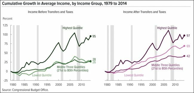
The typical way of talking about income mobility and inequality is to look at the relative income and growth rates of different income quartiles. Here is a chart used recently by Kevin Drum over at Mother Jones:
As you can see, since the three lines here have their steepest upwards slopes at different times, there are a myriad of possibilities for cherry-picking endpoints to make whatever point you want to make. I would say this is a pretty healthy picture, with real income growth for everyone, though the general flatness of the middle income brackets since 2007 seems to get the most notice.
A healthy and growing economy should cause all of these quintiles to grow. But income growth and mobility for individuals is about more than just the quintiles. As a small business owner over the last 20 years, I have had tax returns in all five quintiles -- I have had blowout years when I was "rich" and I have had years when my taxable income would qualify me for food stamps. In other words, I move between the lines -- and so do a lot of other people.
Young people gaining experience and promotions move from lower to higher quintiles as they age. New immigrants often come in at the bottom and progress over time. When people retire, they may fall down a few quintiles. Marriage might kick someone up to a higher quintile, and divorce may lead to them falling down a few. There is a constant ebb and flow that is hidden by merely looking at quintiles.
Russ Roberts, who seems to be the token non-socialist at Medium, writes:
but the biggest problem with the pessimistic studies is that they rarely follow the same people to see how they do over time. Instead, they rely on a snapshot at two points in time. So for example, researchers look at the median income of the middle quintile in 1975 and compare that to the median income of the median quintile in 2014, say. When they find little or no change, they conclude that the average American is making no progress.
But the people in the snapshots are not the same people. These snapshots fail to correct for changes in the composition of workers and changes in household structure that distort the measurement of economic progress. There is immigration. There are large changes in the marriage rate over the period being examined. And there is economic mobility as people move up and down the economic ladder as their luck and opportunities fluctuate.
Roberts describes several studies that follow actual people, not quintiles, and finds that the American ideal of income mobility is still alive and well
This first study, from the Pew Charitable Trusts, conducted by Leonard Lopoo and Thomas DeLeire uses the Panel Study of Income Dynamics (PSID) and compares the family incomes of children to the income of their parents.⁴ Parents income is taken from a series of years in the 1960s. Children’s income is taken from a series of years in the early 2000s. As shown in Figure 1, 84% earned more than their parents, corrected for inflation. But 93% of the children in the poorest households, the bottom 20%, surpassed their parents. Only 70% of those raised in the top quintile exceeded their parent’s income.
... Julia Isaacs’s study for the Pew Charitable Trusts finds that children raised in the poorest families made the largest gains as adults relative to children born into richer families.
The children from the poorest families ended up twice as well-off as their parents when they became adults. The children from the poorest families had the largest absolute gains as well. Children raised in the top quintile did no better or worse than their parents once those children became adults.
He has a lot more at the link.

