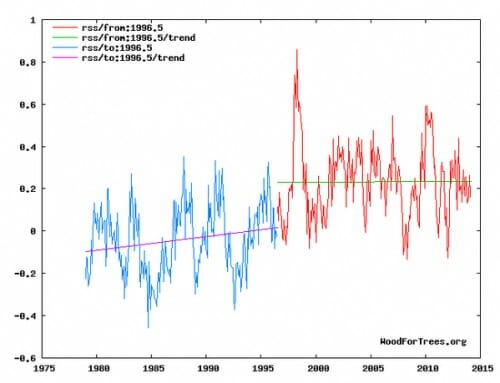
A Bad Chart From My Allies
I try to make it a habit to criticize bad analyses from "my side" of certain debates. I find this to be a good habit that keeps one from falling for poorly constructed but ideologically tempting arguments.
Here is my example this week, from climate skeptic Steven Goddard. I generally enjoy his work, and have quoted him before, but this is a bad chart (this is global temperatures as measured by satellite and aggregated by RSS).
He is trying to show that the last 17+ years has no temperature trend. Fine. But by trying to put a trend line on the earlier period, it results in a mess that understates warming in earlier years. He ends up with 17 years with a zero trend and 20 years with a 0.05 per decade trend. Add these up and one would expect 0.1C total warming. But in fact over this entire period there was, by this data set, 0.3C-0.4C of warming. He left most of the warming out in the the step between the two lines.
Now there are times this might be appropriate. For example, in the measurement of ocean heat content, there is a step change that occurs right at the point where the measurement approach changed from ship records to the ARGO floats. One might argue that it is wrong to make a trend through the transition point because the step change was an artifact of the measurement change. But in this case there was no such measurement change. And while there was a crazy El Nino year in 1998, I have heard no argument from any quarter as to why there might have been some fundamental change in the climate system around 1997.
So I call foul. Take the trend line off the blue portion and the graph is much better.

The real question is not whether or not the earth has warmed but what portion of that warming is the result of CO2. We need to know A - what the sensitivity is to added CO2 and B how well do the models predict this sensitivity.
It would seem the longest period of time with no warming would be an appropriate period for an analysis of both questions A and B (but certainly not the only).
This 17+ year period must be explained. Failure to adequately explain this "pause" goes right to the heart of our understanding of the climate system and the critical model assumptions.
We also need to take Karl Popper approach and understand what evidence would falsify the model projections for CO2 sensitivity. If 17+ years is not long enough to seriously revise sensitivity assumptions- then what period of time is required?
In 2009, as shown by the Climategate emails, it was 15 years: "Bottom line - the no upward trend has to continue for a total of 15 years before we get worried."
So I have no doubt they will kick the can up the road again and say 22 years...
Source http://di2.nu/foia/foia2011/mail/4199.txt
}}} I have heard no argument from any quarter as to why there might have been some fundamental change in the climate system around 1997.
"Global Warming Alarmists are assholes..."
:oD
You said NO argument. You didn't say no GOOD argument... ;-)
There have been changes in the satellites and the instruments used for these measurements, sometimes requiring controversial "adjustments" to splice the old and new data. I don't know exactly when the break occurred, but on that graph it certainly looks like something unusual happened in 1996-98.