Stock Market Returns
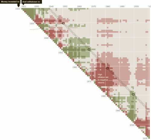
This chart in the NY Times is pretty interesting, though I could quibble about the color coding. You have to stare at it a minute to get it - each cell represents a combination of stock purchase and sales dates, with the color representing the average market inflation-adjusted return for that buy and hold period (click to enlarge, or click through to the source link where it is explained in more depth).
Whenever one uses red and green for coloring a chart, the reader is going to assume red is bad and green is good. In this case, the light red represents returns from 0 to 3% above inflation. Is that bad? Maybe. I would say inflation plus 3% is probably lower than people's expectation of stock market returns, but I think a lot of folks would equate red with capital erosion, which is not the case if returns are out-pacing inflation.
This is sort of a good-news-bad-news story. The good news is that there is no 25-year period where returns fall below inflation. The bad news is that the median return of inflation plus 4% is probably less than most folks are planning for -- including a lot of state pension funds that are still counting on returns like 8% for their entire portfolio (something like inflation + 5-6%), which is a blend of stocks and bonds, implying they are hoping for an equity return north of that.
HT: Flowing Data

It's important to note that these returns are _after_ tax as well. The money managers I know typically tell clients to expect a 3.5% real, after-tax return. Which looks to be like good advice.
If you'd like to extract the exact returns, both with and without the effect of inflation and with and without the effect of dividends (but ignoring any taxes) see:
http://politicalcalculations.blogspot.com/2006/12/sp-500-at-your-fingertips.html
And if you want to see what a hypothetical investment would have returned for you between any two months since January 1871, adjusting for inflation, see:
http://politicalcalculations.blogspot.com/2009/06/investing-through-time.html
The latter tool provides only inflation-adjusted return figures.
> Whenever one uses red and green for coloring a chart
Is automatically shutting out a substantial part of the population (7-10% of men) have red-green color blindness.
Vilmos
i'd always heard the figure of 8% - no accounting for inflation or taxes.
4% accounting for inflation and taxes seems like a similar return.