Today's Chart Award
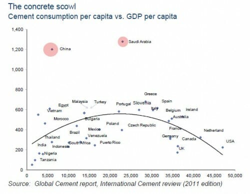
This is my favorite chart I have seen in a while:
I don't know how one would even think to graph these two variables, but it is an interesting picture of the life cycle of development, where infrastructure improvements are initially an important part of the development equation, and then fall off, percentage wise, as wealth is enhanced with softer goods.
Anyone off the chart on the high side are going to be what I would call the triumphalists, who do what Thomas Friedman seems to want and pour a disproportionate share of money into high-visibility monuments (e.g. tall buildings, dams, bridges, high speed rail, etc). I don't see Dubai on here but if they were they might be off the top of the chart.
Zero Hedge links this chart to make a point they have made for a while about a massive bubble bursting coming soon to China, a position with which I agree (though the timing is always a question in such things -- the state has the ability to delay the reckoning at the cost of a worse crash when it eventually comes).
Disclosure: I am short Chinese real estate and stock funds.

I've wanted to short China. Have followed Chanos on this matter (was a classmate in college). How are you doing so?
There are Chinese real estate and stock funds you can be short on? Which ones?
An EKC for cement? Add in the price of cement and you'd have a pretty nice little regression.
Your source needs to label axises.
While in Saudi Arabia, I noticed that many of their roads are paved with concrete rather than asphalt. (because of the intense heat / sun maybe?)
Can't be just a preference of concrete over asphalt, as it's still crazily out of whack with GDP spending. If it's concrete road building, then they're building too many.
I drove through Saudi Arabia a few times in '90-91. The roads out of Jubail port were enormous - at least six lanes both directions - and completely empty except for us in the middle of the afternoon. It was kind of creepy.
Erase the curve and look again at the dots. Leave out the Saudis and the Chinese data. I don't see the trend you claim.
You should try a linear trend as well and compare the goodness of fit to both it and the curve. I expect that you will find no significant correlation for either.
The internet and the refereed scientific literature is full of data plots that show little or no correlation between the variables. Razib over at Gene Expression loves these sorts of plots.
Doesn't anyone teach Stat 101 anymore? Does anyone read Tufte?
Actually, it looked like a connect-the-dot picture of Jabba the Hut to me. Wait, is Hut spelled with two T's?
Erase the curve and look again at the dots. Leave out the Saudis and the Chinese data. I don’t see the trend you claim.
You should try a linear trend as well and compare the goodness of fit to both it and the curve. I expect that you will find no significant correlation for either.
Huh? You don't see the trend?
Why would you bother fitting a linear curve to these data when the relationship is obviously nonlinear? The point is that there is a clear, cross-sectional relationship between income/development and cement consumption, with China and Saudi Arabia as the outliers. One can speculate as to why that is, but I suspect their penchant for central economic planning (and triumphalism) has something to do with it.