This Isn't A Map of Global Warming, It's A Map of Corrupted Temperature Stations
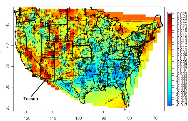
Kevin Drum published this map on his blog, which he says was originally from the Washington Post. He does not include a link so I can't give any more background on the chart. For example, I have no idea which surface temperature data set it is based on.

The fact that smart guy like Kevin Drum can publish this uncritically just demonstrates how little even vociferous global warming advocates actually understand about the issue. Because all this chart does is reinforce a skeptic argument that the global surface temperature data set is corrupted and can exaggerate warming trend data.
Let's start with this: I have read much of the IPCC reports and have skimmed the rest, and I can say with certainty that these reports contain no theory about how increasing the concentration of atmospheric CO2 from 0.03% to 0.04% causes warming of 2C or more focused in hotspots as small as a 50 mile radius. There is absolutely no theory, and I would argue no way, that a general global warming trend of 1-1.5C per century is causing warming 2-3 times that rate narrowly over San Jose, California or Phoenix, AZ.
The fact that many of these hotspots are focused over urban areas is a good indicator that this temperature data set is corrupted with urban heat island biases. This is a different kind of man-made effect but one which is local and is not the result of a global warming trend, and thus should not be in a database aimed at measuring this global warming trend.
Something like 10 years ago I saw a similar chart online based on USHCN measurement stations. At that time, the chart showed a hotspot over Tucson
At the time, Anthony Watt was running his Surface Stations project to document the conditions of all the USHCN temperature stations (the crosses on the map) that formed the basis of the US global warming / temperature trend numbers. So I drove down to Tucson to see the temperature station in the middle of that hotspot. What I found was that the temperature station that 100 years ago was in a rural open field was now measuring the temperature of an asphalt parking lot in the middle of a large city:
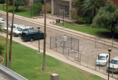
As an aside, this was a fun project as I still see this picture reproduced in random places from time to time. After this picture got some publicity, the government shut this station down and moved it to a better location.
But the point is that the hotspot on the temperature change map was both real and fake. Real in the sense that Tucson was definitely hotter due to the change in land use, as are most all cities (just watch the weather in a city and they will often say that it will be a low of 45 in the city, and 40 in the outlying areas). My son and I measured the urban heat island in Phoenix for a high school science project. We found it to be as high as a 6-8F difference between city and the surrounding countryside at certain times of day.

But the hotspot was fake because this had nothing to do with global warming from CO2, and thus including this hotspot in the temperature data was exaggerating the global warming trend. This is especially true since there are only a few data points, so this reading for Phoenix was averaged into the reading all over the Southwest and tended to raise the official temperatures for much of Arizona, not just in Tucson. Where temperature stations are sparse, such as in northeast Montana, a single bad surface temperature station can corrupt the data for a large area. This effect is even further exaggerated in places like Africa, where temperature stations can be hundreds of kilometers apart.
This is one reason satellite temperature measurement makes so much sense, as it is not subject to these sorts of biases (though it has other issues, including sensor drift and the fact that satellites can shift orbits and eventually die). Whenever you see high temperature records today, they are usually set in the city at the airport, a big paved facility in the center of an urban area that 50 years ago was probably an open field. There is a good chance the record has more to do with urbanization around the temperature measurement station than with global warming.
I believe the scientific community at NOAA and GISS have been almost criminally negligent with the surface temperature network over the last 30 years. In the late 80's, when we became concerned with global warming, experts knew all too well about vast problems in how we measure surface temperatures. We have invested tens of billions of dollars to fight global warming, but practically zero to measure it better. We should have invested in a better, more reliable, less biased (in the scientific not political sense of that word) measurement system. The amount of money we wasted in Solyndra would have paid for the upgrades, but we still have done nothing. As a result, much of the warming signal is actually manual corrections to the raw data, undermining the signal to noise ratio of this critical metric and calling into question the bias (in the political not scientific sense) of these manual corrections (eg here and here). For example, it turns out the past continues to cool.


The Danish Meteorological Institute, which has a key role in monitoring Greenland’s climate, last week reported a shocking August temperature of between 2.7C and 4.7C at the Summit weather station, which is located 3,202m above sea level at the the centre of the Greenland ice sheet, generating a spate of global headlines.
But on Wednesday it posted a tweet saying that a closer look had shown that monitoring equipment had been giving erroneous results.
“Was there record-level warmth on the inland ice on Friday?” it said. “No! A quality check has confirmed out suspicion that the measurement was too high.”